Since the beginning, we try to present to you, one after the
other new iOS 8. Today it is the mail app you'll be interested. This year no
great revolution in the program, but several handy improvements which should
make it more convenient in everyday life.
Mail management or drafts, we see what Apple store for its
email client on iPhone as on iPad:
As I said earlier, this year, the Mail application is the
watchword improvement. Today when we consult the list of emails, a shift from
right to left brings up a menu of both boxes.
The first simply proposes to delete mail while the second
provides access to a full menu and transfer, mark or move mail.
You Can’t Miss: How
to Transfer Contacts from iPhone to iPhone
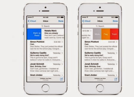
iOS 8, the same gesture will have a slightly different
effect.
As we have seen in many alternative apps, sliding across the
surface of the screen to delete the email without clicking. A shorter shift
will in turn appear three boxes:
•
The first sends the mail to the trash
•
the second to add a flag e
•
Does the third to access the menu. This menu a new entry 'Notify Me' also
appeared.

A shift in the other direction will effectively mark the
message as read or not. The same sliding longer will effectively perform the
action without having to press again on the screen.
iOS 8, a swipe down to hide the draft and to access their
emails. When the information sought and eventually copied the draft is active
again by simply pressing the bottom of the screen. It's simple, but very
practical.
Evolution, not revolution, then, but the innovations
introduced with iOS 8 should help to make it more user-friendly and practical
application.
Related Posts:
thank your article, I want to translate it into Vietnamese to post to my blog. Looking forward you agree
ReplyDeleteThis is 2 my blog:
Thủ thuật công nghệ và tai nghe iphone